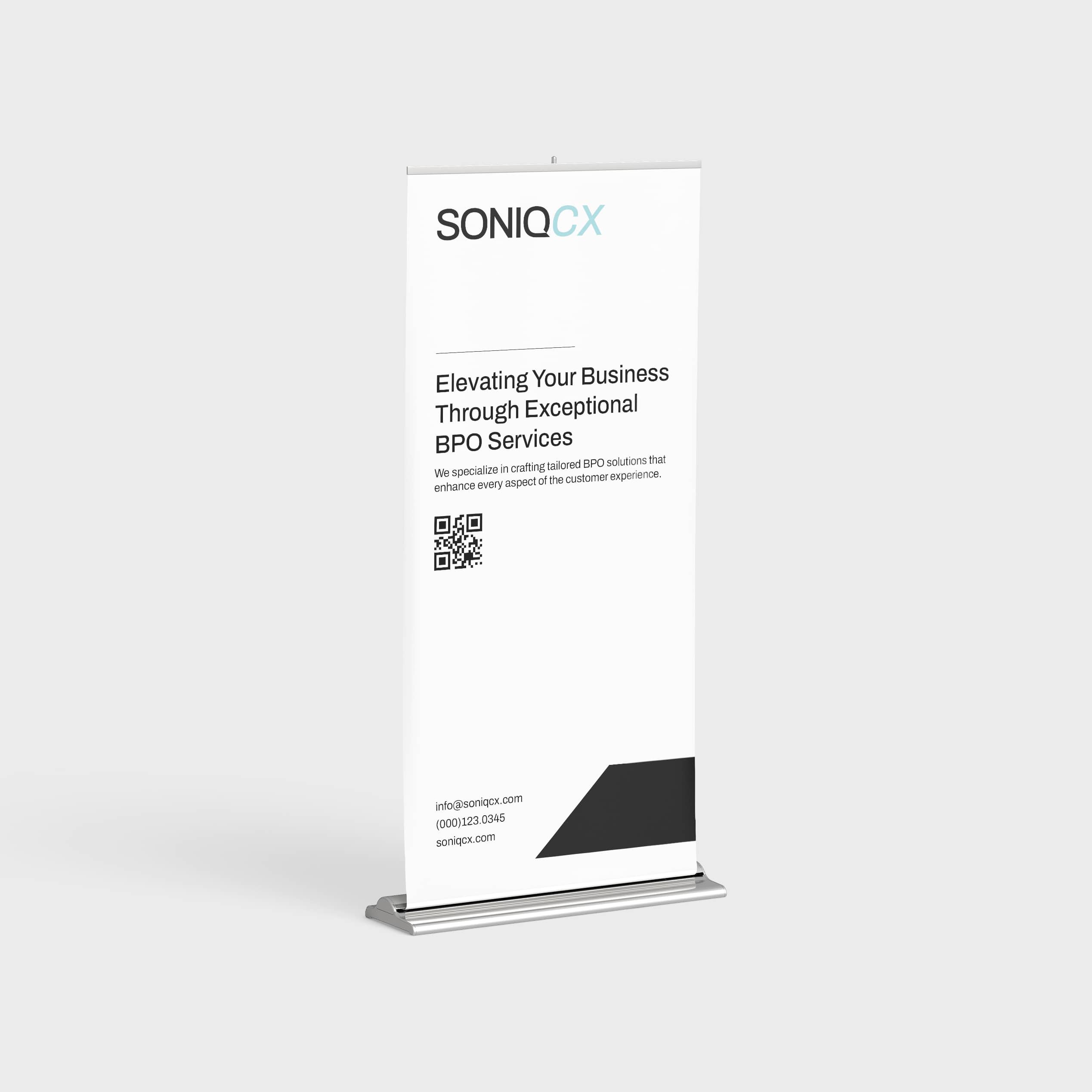
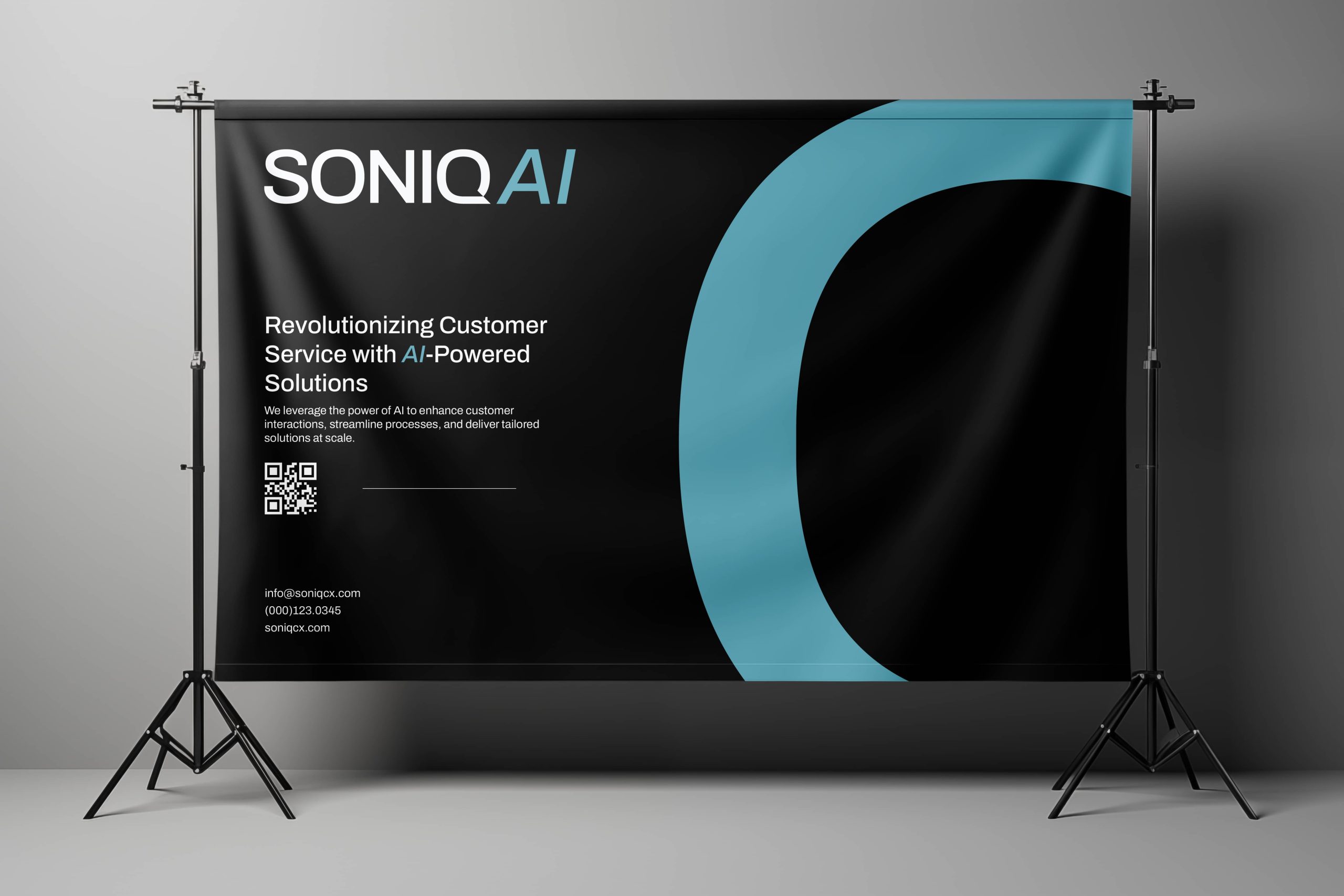
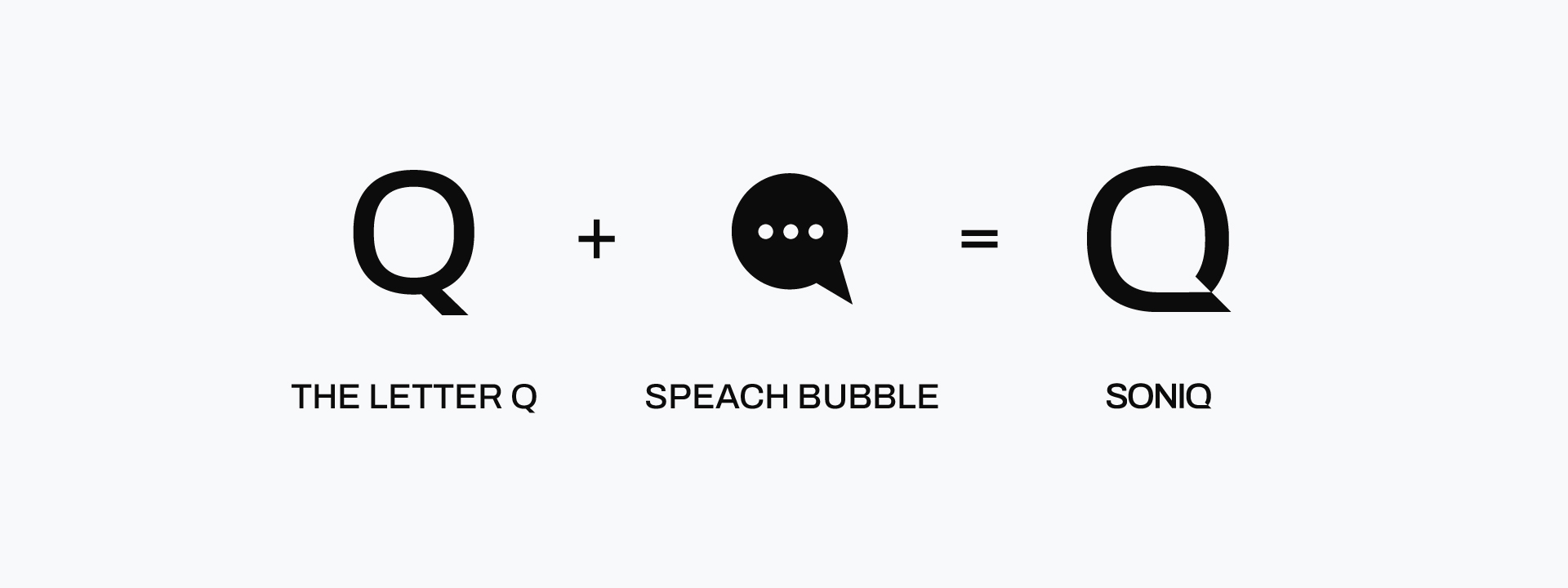
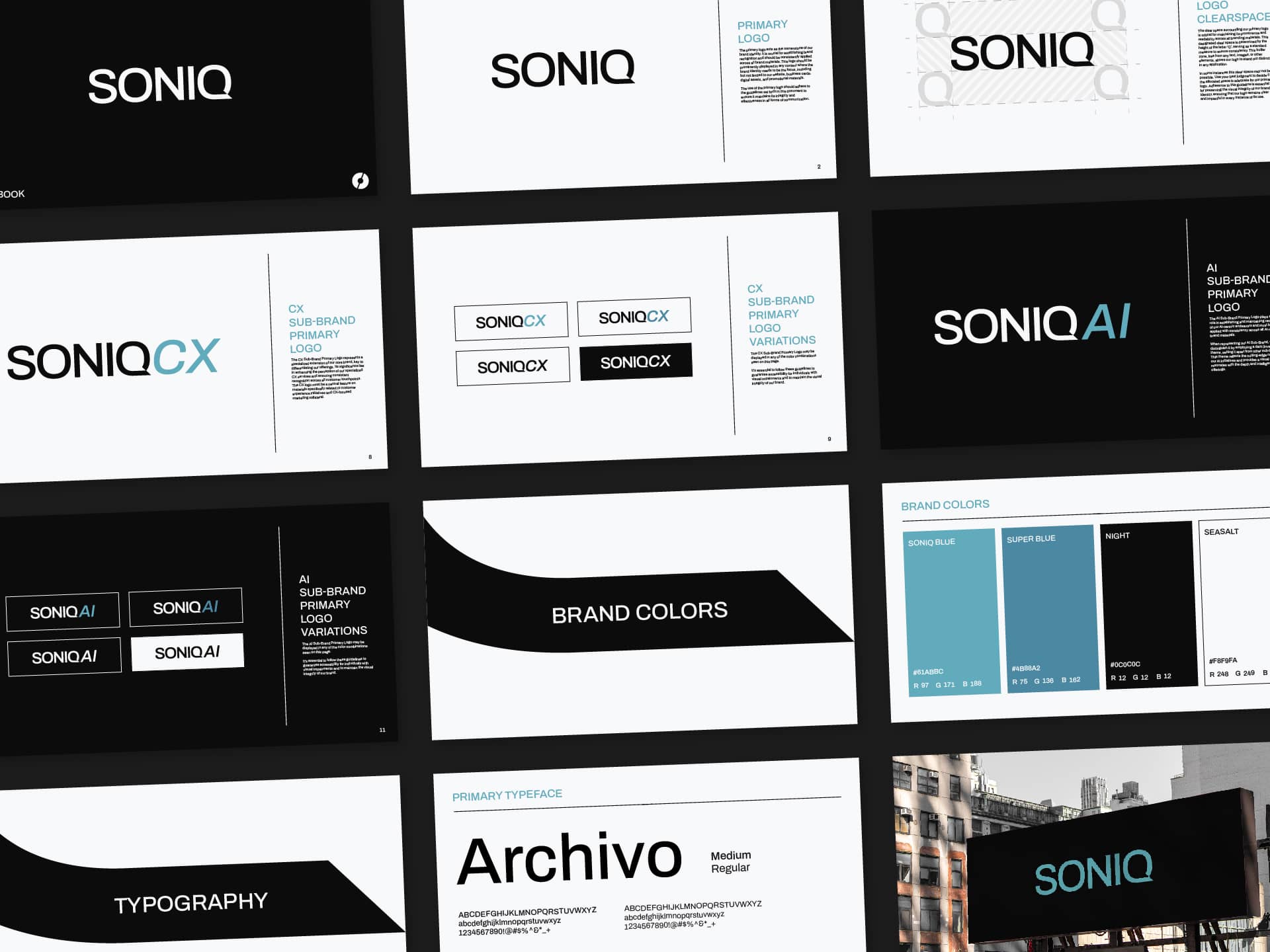
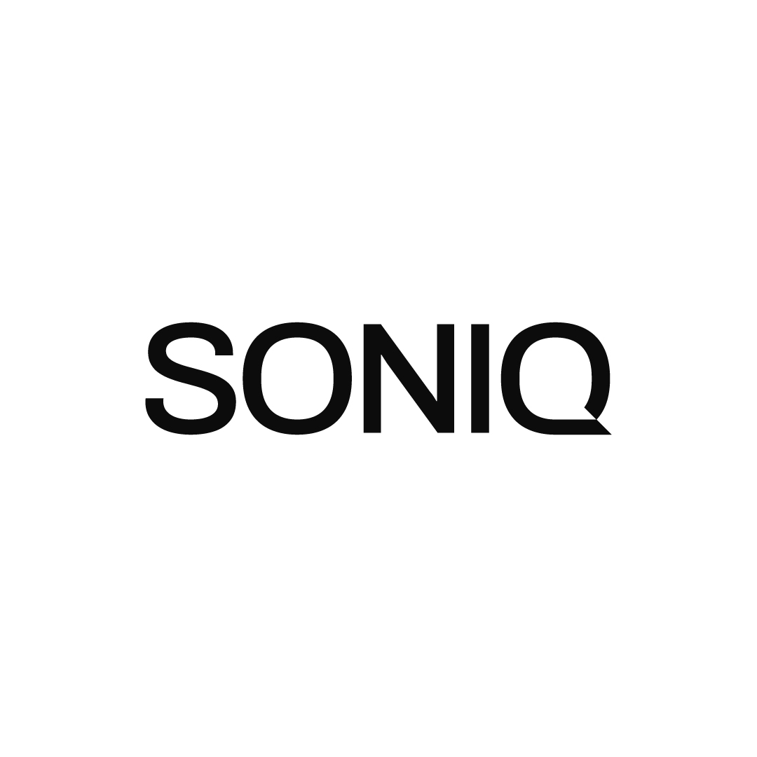
We designed the SONIQ brand to be simple and evocative. By utilizing the negative space in the 'Q,' we created a speech bubble, a visual element commonly associated with contact centers. This clean and purposeful design approach extends to the sub-brands: SONIQCX and SONIQAI. A subtle yet intentional distinction is made between the two; SONIQCX is always displayed on a light-colored background, while SONIQAI is presented on a dark-colored background. This contrast helps differentiate the sub-brands while maintaining a cohesive identity for SONIQ as a whole.